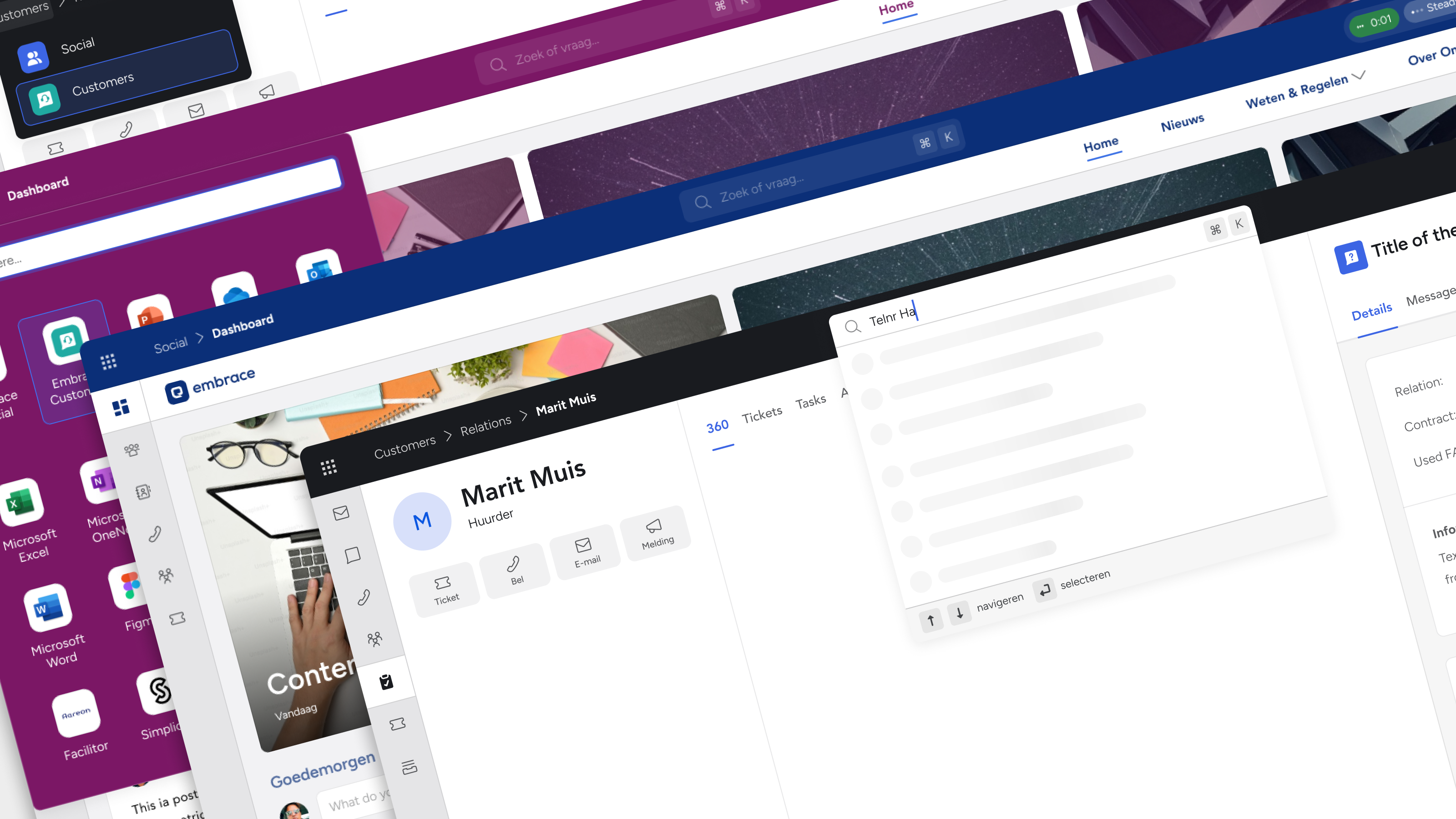
Building for the future: Scalable navigation
Case study by

Max van IJsselmuiden

Role
Lead UX Designer
Challenge
Transform navigation from fragmented patterns into a scalable foundation for Suite expansion
Impact
Established unified navigation standard, created space for AI integration and future features
Period
2024 - 2025
At Embrace - The Human Cloud, our Suite platform was facing a critical scalability challenge. As we planned major feature expansions—AI assistants, phone client integration, help center—our existing topbar couldn't accommodate the growth. Users struggled with navigation clarity, and our design patterns varied inconsistently across applications.
The ever-expanding SaaS suite needed ‘screen real estate’; new features couldn’t be implemented because the current navigation patterns lacked the structure to support them.
Discovery
The constraint that forced innovation
The navigation pattern (sidebar only) suffered from fundamental limitations:
These started as clear functional metaphors, but many have become purely learned conventions. We know what the save icon means not because we work with floppy disks, but because we've been taught this symbol equals 'save.'
This wasn't about incremental improvement. The current navigation pattern had become a development bottleneck preventing feature rollout.

The status before this project, sidebar only (taken from one of the stakeholders meetings)
Strategy
Jakob’s Law as the foundation
We built the strategy around Jakob's Law: users expect our interface to work like other interfaces they're familiar with. This meant leveraging established patterns for:
- Navigation hierarchy: Clear breadcrumb patterns users recognize
- Search placement: Prominent, accessible positioning matching system conventions
- Feature organization: Logical groupings that align with user mental models

Jakob’s Law (taken from one of the stakeholders meetings)
The core insight was architectural: Suite-level vs. app-specific distinction. The topbar would handle Suite-wide functionality (navigation, search, user account), while sidebars remained app-specific. This created clear information architecture that users could immediately understand.

The different area’s have clear purposes (taken from one of the stakeholders meetings)
Future needs space
The vision centered on one principle: our future needs space. Planned integrations included AI assistant access through enhanced search functionality, phone client integration for CRM calling features, help center contextual to user location, and system status communication for platform updates. Rather than retrofitting features later, we'd build the foundation correctly now.

Explanatory slide (taken from one of the stakeholders meetings)
Design
The proof-of-concept strategy
The biggest challenge wasn't design, but rather stakeholder confidence. The topbar touches every part of the Suite, making the change feel massive and high-risk. We needed to prove that high visual and UX impact could come with minimal development investment.
Working directly with a developer, we prepared a functional proof-of-concept that demonstrated the technical simplicity behind the visual transformation. This PoC became crucial for stakeholder buy-in, showing that what looked like a major overhaul was actually an efficient implementation.
Navigation
One of the most important problems to be solved, is the fact that users have trouble recognizing where they are. A possible solution for this would be to introduce a top level breadcrumb navigation (to be defined) to always clearly state the current path. This would follow common patterns and adds a clear hierarchical structure.

A solution to solve navigation ambiguity (taken from one of the stakeholders meetings)
App launcher
One of the most-used features of the Suite is the app launcher. It enables our users to pin and save any frequently used applications (configured per organization), making it a key starting point for their workday.
The app launcher can be accessed via the top left, directly connected to the topbar.

App launcher integrates well into the topbar (taken from one of the stakeholders meetings)
Theming integration advantage
Our social intranet clients choose our platform specifically for personalization capabilities. The new topbar design enhanced theming integration, making organizational branding feel more natural and comprehensive than before. This turned a navigation update into a competitive advantage for client retention.

Showcasing the different theming options
Search pattern synergy
The topbar integrated seamlessly with the search redesign we'd completed earlier. The existing quick search pattern adapted perfectly to the compact topbar space, creating consistency between major interaction points and reinforcing the Suite-wide navigation concept.
Still, to show the potential of an improved search interaction in the topbar (added AI assistant capabilities), the slides of the presentation showed a slightly tweaked variant.

Showcasing the Search + AI possibilities (taken from one of the stakeholders meetings)
Validation
Stakeholder alignment through data
I presented the vision through structured slides and collected feedback via Microsoft Forms to ensure objective evaluation. The results were decisive:
- 4.33/5 rating for addressing genuine user needs
- Unanimous agreement to move forward with implementation
- Clear feature priorities: Search, app launcher, and user profile identified as most valuable topbar elements
Two stakeholder discussion rounds were sufficient to reach alignment, demonstrating how the PoC and structured presentation addressed concerns proactively.

Votes for possible functionalities taken from the feedback form.
Implementation
Building the foundation for growth
The three-month implementation timeline focuses on establishing patterns that would support future development rather than just solving current problems. By creating clear suite vs. app-specific boundaries, we built a navigation system that could accommodate new features without architectural changes.
The topbar will be the foundation for feature rollout rather than a constraint. Phone client integration can finally be improved, AI search will gain a natural entry point, and help center contextual features have a logical home.
The design established consistent patterns across the Suite while leveraging familiar user expectations through Jakob's Law. Most importantly, it proved that strategic UX thinking—building foundations for future needs rather than just solving current problems—creates exponential value over time.
This project demonstrated how thoughtful navigation architecture becomes invisible infrastructure that enables everything else to work better.
At the time of writing, this project has yet to complete its implementation. I’m very much looking forward to this process and excited to see the implemented variant have a huge impact on the Suite’s ease of navigation.
Did you like this post?
Want to stay tuned?
Building for the future: Scalable navigation
Case study by

Max van IJsselmuiden

Role
Lead UX Designer
Challenge
Transform navigation from fragmented patterns into a scalable foundation for Suite expansion
Impact
Established unified navigation standard, created space for AI integration and future features
Period
2024 - 2025
At Embrace - The Human Cloud, our Suite platform was facing a critical scalability challenge. As we planned major feature expansions—AI assistants, phone client integration, help center—our existing topbar couldn't accommodate the growth. Users struggled with navigation clarity, and our design patterns varied inconsistently across applications.
The ever-expanding SaaS suite needed ‘screen real estate’; new features couldn’t be implemented because the current navigation patterns lacked the structure to support them.
Discovery
The constraint that forced innovation
The navigation pattern (sidebar only) suffered from fundamental limitations:
- Navigation ambiguity: user’s couldn’t clearly identify their current location
- Screen real estate waste: inefficient usage of navigation space
- Feature bottleneck: no logical place of adding new capabilities
- Pattern inconsistency: navigation varied between applications
This wasn't about incremental improvement. The current navigation pattern had become a development bottleneck preventing feature rollout.

The status before this project, sidebar only (taken from one of the stakeholders meetings)
Strategy
Jakob’s Law as the foundation
We built the strategy around Jakob's Law: users expect our interface to work like other interfaces they're familiar with. This meant leveraging established patterns for:
- Navigation hierarchy: Clear breadcrumb patterns users recognize
- Search placement: Prominent, accessible positioning matching system conventions
- Feature organization: Logical groupings that align with user mental models

Jakob’s Law (taken from one of the stakeholders meetings)
The core insight was architectural: Suite-level vs. app-specific distinction. The topbar would handle Suite-wide functionality (navigation, search, user account), while sidebars remained app-specific. This created clear information architecture that users could immediately understand.

The different area’s have clear purposes (taken from one of the stakeholders meetings)
Future needs space
The vision centered on one principle: our future needs space. Planned integrations included AI assistant access through enhanced search functionality, phone client integration for CRM calling features, help center contextual to user location, and system status communication for platform updates. Rather than retrofitting features later, we'd build the foundation correctly now.

Explanatory slide (taken from one of the stakeholders meetings)
Design
The proof-of-concept strategy
The biggest challenge wasn't design, but rather stakeholder confidence. The topbar touches every part of the Suite, making the change feel massive and high-risk. We needed to prove that high visual and UX impact could come with minimal development investment.
Working directly with a developer, we prepared a functional proof-of-concept that demonstrated the technical simplicity behind the visual transformation. This PoC became crucial for stakeholder buy-in, showing that what looked like a major overhaul was actually an efficient implementation.
Navigation
One of the most important problems to be solved, is the fact that users have trouble recognizing where they are. A possible solution for this would be to introduce a top level breadcrumb navigation (to be defined) to always clearly state the current path. This would follow common patterns and adds a clear hierarchical structure.

A solution to solve navigation ambiguity (taken from one of the stakeholders meetings)
App launcher
One of the most-used features of the Suite is the app launcher. It enables our users to pin and save any frequently used applications (configured per organization), making it a key starting point for their workday.
The app launcher can be accessed via the top left, directly connected to the topbar.

App launcher integrates well into the topbar (taken from one of the stakeholders meetings)
Theming integration advantage
Our social intranet clients choose our platform specifically for personalization capabilities. The new topbar design enhanced theming integration, making organizational branding feel more natural and comprehensive than before. This turned a navigation update into a competitive advantage for client retention.

Showcasing the different theming options
Search pattern synergy
The topbar integrated seamlessly with the search redesign we'd completed earlier. The existing quick search pattern adapted perfectly to the compact topbar space, creating consistency between major interaction points and reinforcing the Suite-wide navigation concept.
Still, to show the potential of an improved search interaction in the topbar (added AI assistant capabilities), the slides of the presentation showed a slightly tweaked variant.

Showcasing the Search + AI possibilities (taken from one of the stakeholders meetings)
Validation
Stakeholder alignment through data
I presented the vision through structured slides and collected feedback via Microsoft Forms to ensure objective evaluation. The results were decisive:
- 4.33/5 rating for addressing genuine user needs
- Unanimous agreement to move forward with implementation
- Clear feature priorities: Search, app launcher, and user profile identified as most valuable topbar elements
Two stakeholder discussion rounds were sufficient to reach alignment, demonstrating how the PoC and structured presentation addressed concerns proactively.

Votes for possible functionalities taken from the feedback form.
Implementation
Building the foundation for growth
The three-month implementation timeline focuses on establishing patterns that would support future development rather than just solving current problems. By creating clear suite vs. app-specific boundaries, we built a navigation system that could accommodate new features without architectural changes.
The topbar will be the foundation for feature rollout rather than a constraint. Phone client integration can finally be improved, AI search will gain a natural entry point, and help center contextual features have a logical home.
The design established consistent patterns across the Suite while leveraging familiar user expectations through Jakob's Law. Most importantly, it proved that strategic UX thinking—building foundations for future needs rather than just solving current problems—creates exponential value over time.
This project demonstrated how thoughtful navigation architecture becomes invisible infrastructure that enables everything else to work better.
At the time of writing, this project has yet to complete its implementation. I’m very much looking forward to this process and excited to see the implemented variant have a huge impact on the Suite’s ease of navigation.
Did you like this post?
Want to stay tuned?